Visual communication has become the silent salesperson. Many consumers believe a company’s sign reflects its products and services. That’s why businesses are increasingly turning to acrylic signage.
You can uncover the transformative potential of color acrylics for commercial branding. Whether you’re a local retailer or a franchise, this guide shows you how to make color work well for your business.
What are Color Acrylic Sheets?
Color acrylic sheets are a vibrant version of traditional clear acrylic. The polymethyl methacrylate (PMMA) sheets are infused with colorants during production. And it produces a broad spectrum of hues, transparencies, and finishes.
Common Color Integration Methods
- Body Coloring (Mass Pigmentation): Pigments are added directly into the molten PMMA before casting or extrusion. Uniform color prevails throughout the sheet, even if scratched or cut. The opaque and translucent sheets have uses in signage, furniture, and architectural panels.
- Surface Coating or Lamination: A colored film or coating is applied to the surface of a transparent acrylic sheet. Vibrant finish prevails against less durability; scratches may reveal the clear base. Decorative panels, temporary displays, and low-impact installations heavily rely on these.
Features of Color Acrylic Sheets
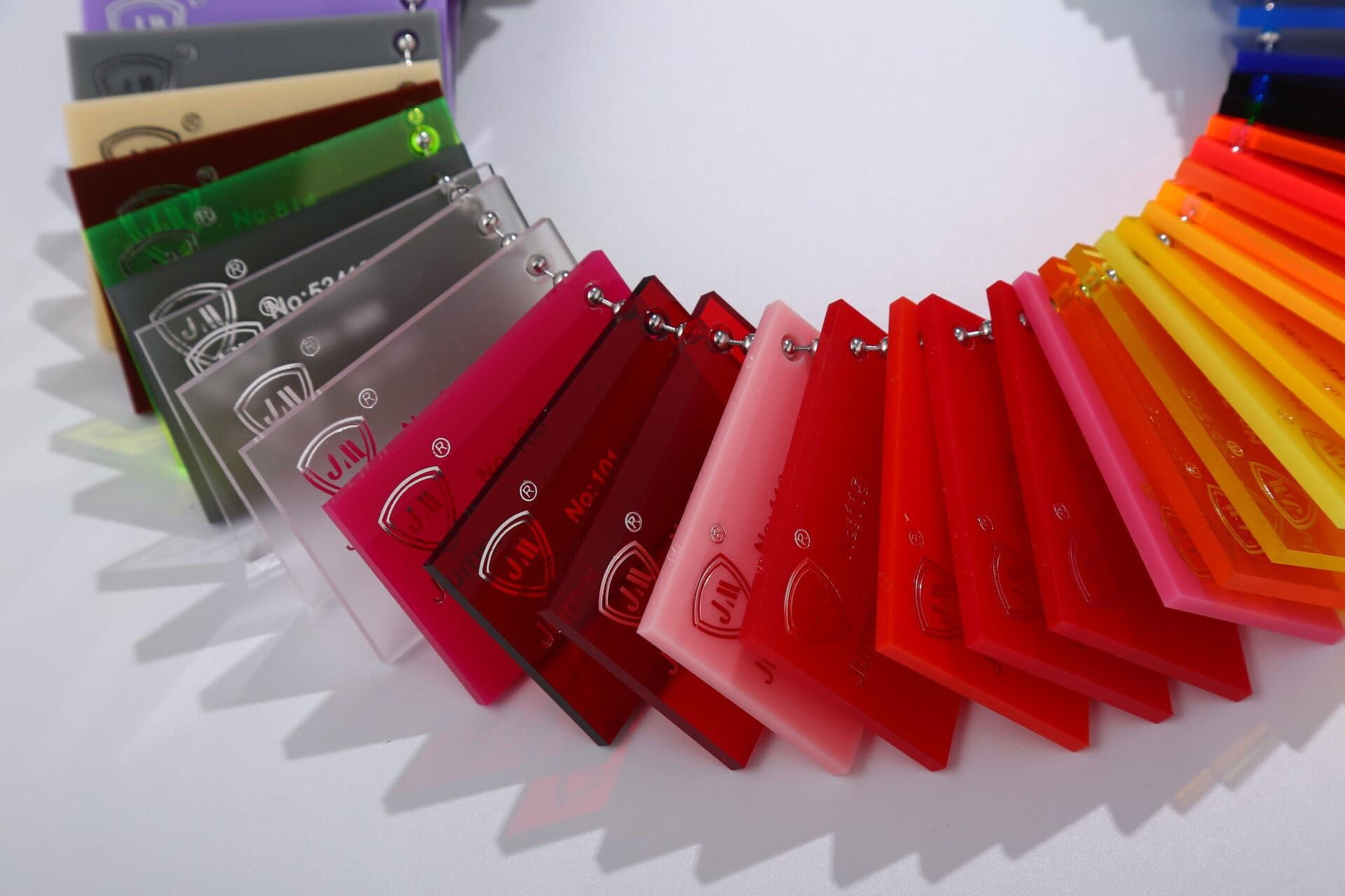
- Color Variety: Available in solid, transparent, translucent, fluorescent, and frosted tones.
- Light Transmission: Ranges from 0% (opaque) to 92% (clear) depending on pigmentation.
- Thickness Range: Typically, 1.5mm to 30mm; thicker sheets are used for structural applications.
- Finish Options: Glossy, matte, textured, mirrored, frosted.
- UV and Weather Resistance: Many variants are UV-stabilized for outdoor use.
- Fabrication Flexibility: Can be laser-cut, CNC-routed, engraved, or thermoformed.
Benefits for Businesses
- Brand Visibility: Vibrant colors enhance signage and storefront appeal.
- Durability: Up to 17x stronger than glass, ideal for high-traffic areas.
- Lightweight: Half the weight of glass, reducing installation costs.
- Customizability: Easily shaped and engraved for logos, displays, and partitions.
- Sustainability: Recyclable and available in eco-friendly formulations.
Color Acrylic Sheet Market Overview
The market is a dynamic segment within the broader acrylics industry. It’s driven by demand for vibrant, durable, and customizable materials across signage, architecture, automotive, and retail sectors.
Global Market Size
The global acrylic sheets market was valued at USD 4.39 billion in 2022. It’s projected to reach USD 8.39 billion by 2032, growing at a CAGR of 6.7%.
The colored acrylic segment is gaining traction due to its aesthetic appeal and branding potential. It’s particularly true for signage and display applications, which account for a significant portion.
Asia-Pacific leads the market with over 34% global revenue share. It’s driven by rapid urbanization, retail expansion, and infrastructure development.
Key Growth Drivers
- Retail and Advertising Boom: Demand for eye-catching displays and storefront signage is surging, especially in e-commerce and experiential retail.
- Healthcare Expansion: Acrylic barriers and signage are increasingly used in hospitals for hygiene and wayfinding.
- Construction and Architecture: Acrylic sheets are favored for skylights, partitions, and decorative panels due to their lightweight and impact resistance.
- Automotive Innovation: Used in windshields, interior trims, and lighting components to reduce weight and improve fuel efficiency.
Market Challenges
- Raw Material Volatility: Prices of methyl methacrylate (MMA), a key input, fluctuate with oil markets, impacting production costs.
- Competition from Substitutes: Polycarbonate and glass offer alternative solutions, especially in high-impact or high-temperature environments.
- Environmental Concerns: VOC emissions during production and disposal challenges are prompting demand for recycled acrylic options.
Design Considerations for Signage
- Thickness Selection: Ranges from 1.5mm to 30mm depending on structural needs.
- Finish Options: Glossy for sleek branding, matte for anti-glare readability, and textured for tactile signage.
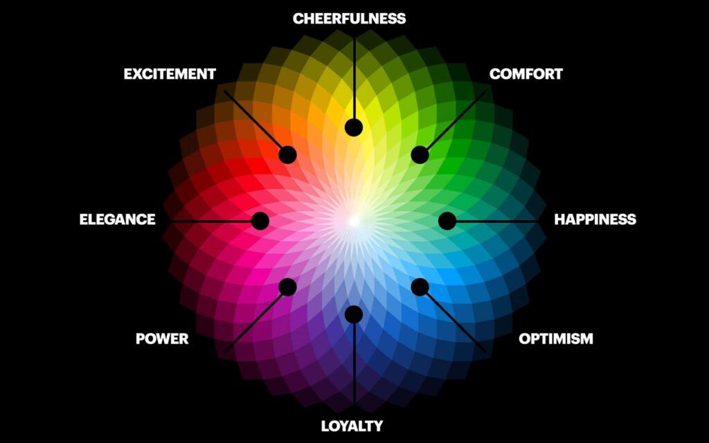
- Color Psychology: Use red for urgency, blue for trust, green for eco-conscious branding.
The Psychology and Science of Color in Signage
Color is a strategic tool to shape perception, drive behavior, and reinforce brand identity. The choices can make the difference between being noticed or ignored, trusted or dismissed.
A. Color Psychology in Business Signage
Color affects up to 85% of purchasing decisions and increases brand recognition by 80%. Customers process color before text, forming emotional impressions in milliseconds.
Example: Red triggers urgency and appetite (used by McDonald’s), while blue builds trust (used by banks like Chase).
Emotional Association with Colors
| Color | Emotional Impact | Common Use Cases |
|---|---|---|
| Red | Urgency, passion, appetite | Fast food, clearance sales |
| Blue | Trust, calm, professionalism | Finance, healthcare, tech |
| Green | Health, nature, sustainability | Wellness, eco-friendly brands |
| Yellow | Optimism, friendliness, energy | Retail, entertainment, family services |
| Black | Sophistication, luxury, authority | High-end fashion, law firms |
| White | Cleanliness, simplicity, purity | Healthcare, minimalist brands |
| Orange | Creativity, enthusiasm, warmth | Sports, youth brands, adventure gear |
| Purple | Luxury, imagination, elegance | Beauty, premium services |
Studies show that 90% of snap judgments are based on color alone.
Cultural Considerations
White symbolizes purity in Western cultures, but mourning in parts of Asia. Red is seen as lucky in China but can signal danger in Western contexts. Brands must tailor color choices to regional and cultural expectations to avoid misinterpretation.
B. Visibility and Contrast Principles
Black on white, yellow on black, and white on blue are proven to be the most legible. High contrast improves readability from a distance and in low-light conditions.
For a viewing distance of <10 ft, try subtle contrast (navy on white). When the distance remains within 10 – 50 ft, bold contrast (red on white) works the best. For more than 50 ft distance, try to maximize the contrast (black on yellow). Each inch of letter height provides ~10 ft of readability.
Impact of Lighting Conditions: Natural light can wash out pale colors; use saturated tones outdoors. Backlit signs benefit from translucent acrylics with high color density. Night visibility improves with reflective materials and LED integration.
Accessibility for Color-Blind Customers: Use patterns, icons, and text labels alongside color. Avoid red-green combinations; opt for blue-yellow or black-white. Follow WCAG guidelines: minimum contrast ratio of 4.5:1 for standard text.
C. Brand Color Consistency
Consistency in colors across signage, packaging, and digital assets –
- Reinforce brand identity.
- Build trust and recognition.
- Improve customer recall by up to 80%.
Color Matching Technologies: Pantone Matching System (PMS) ensures precise color reproduction. Spectrophotometers measure color accuracy during production. Digital proofing helps preview signage under different lighting conditions.
Quality Control Measures: Use color swatch books and calibrated printers. Request physical samples before mass production. Collaborate with vendors who offer color certification and batch consistency checks.
Long-Term Color Stability
Choose UV-resistant inks and acrylics to prevent fading. Opt for cast acrylic sheets for better pigment retention over time. Regular maintenance and cleaning preserve vibrancy and legibility.
RetailGraphics reports that consistent brand colors in signage increase customer trust and loyalty, especially in competitive retail environments.
Real-Time Example: Starbucks
The world-recognized brand uses green to evoke nature, relaxation, and sustainability. It maintains color consistency across signage, cups, and digital platforms using Pantone 3425C. Such an approach reinforces brand values and customer experience globally.
Branding Applications of Color Acrylic Signage
Color acrylic signage is not only a visual accessory but also a powerful branding tool. From corporate HQs to retail storefronts, its versatility creates consistent, scalable, and memorable brand experiences.
Corporate Identity and Brand Recognition
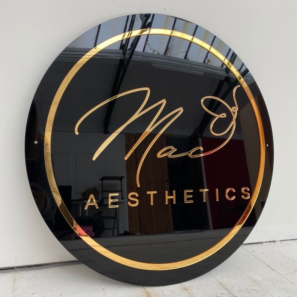
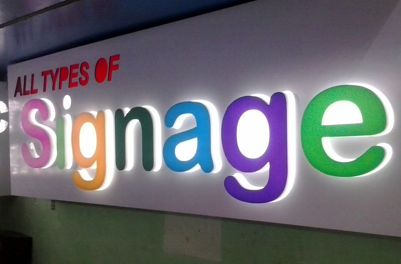
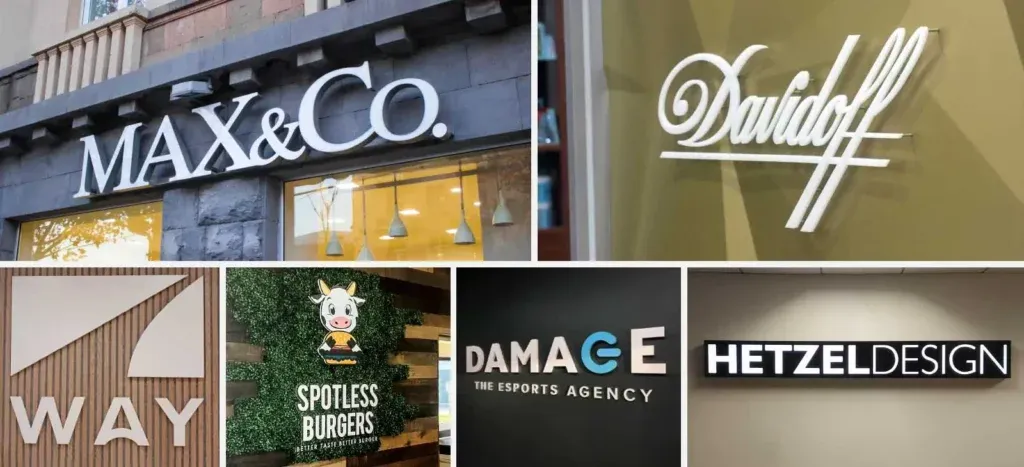
- Logo Reproduction and Dimensional Lettering: Acrylic’s precision-cut capabilities allow 3D logos and raised lettering for visibility and engagement.
- Corporate Color Scheme Implementation: Acrylic sheets can be Pantone-matched during manufacturing. It ensures brand colors are faithfully reproduced across all signage elements.
- Scalability: From small indoor plaques to large outdoor illuminated signs, acrylic signage scales effortlessly while maintaining design integrity.
- Brand Guideline Compliance: Acrylic signage supports strict adherence to brand guidelines through consistent typography, spacing, and finish options (glossy, matte, frosted).
Studies show that consistent brand visuals across touchpoints can increase revenue by up to 23% due to improved customer recognition and trust.
- Franchise and Multi-Location Considerations: Acrylic signage enables standardized branding across branches, ensuring uniformity in customer experience.
- Specification Standardization: Centralized design templates and material specs (thickness, finish, mounting style) streamline production and reduce errors.
- Quality Control Processes: Use of color calibration tools and batch testing ensures signage meets brand standards before deployment.
- Cost Management: Acrylic’s lightweight nature reduces shipping and installation costs by up to 30% compared to glass or metal alternatives.
Tiffany & Co. used Pantone-matched acrylic plinths across 12 countries to maintain brand color fidelity in global rollouts.
Industry-Specific Applications
a. Retail/Storefront Sales
- Storefront Signage: High-gloss acrylic enhances curb appeal and brand visibility.
- Window Displays: Transparent or fluorescent acrylic creates dynamic light effects.
- Point-of-Sale Displays: Custom shapes and vibrant colors drive impulse purchases.
- Wayfinding Systems: Clear, durable signage improves customer navigation.
- Interior Accent Walls: Branded panels reinforce identity and elevate ambience.
Louis Vuitton’s acrylic window installations increased average customer spend by 22%.
b. Healthcare and Professional Services
- ADA-Compliant Room Signs: Laser-engraved acrylic supports tactile and Braille elements for accessibility.
- Professional Appearance: Frosted or matte finishes convey a sense of cleanliness and trust—ideal for clinics and law firms.
- Hygiene Standards: Acrylic’s non-porous surface is easy to disinfect, ensuring compliance with healthcare sanitation protocols.
- Calming Color Choices: Soft blues, greens, and neutrals reduce patient anxiety and support wellness branding.
Acrylic signs in hospitals meet UL94 V-0 flame-retardant standards and resist microbial growth.
c. Educational Institutions
- School Spirit Branding: Colored acrylic in team colors for gym signs and banners.
- High-Traffic Durability: Impact-resistant sheets withstand student environments.
- Safety and Emergency Signage: UV-stable acrylic ensures visibility in outdoor and emergency settings.
- Campus Wayfinding Systems: Modular, color-coded signs improve navigation and accessibility.
Tokyo Ginza schools have used acrylic signage for over 12 years with 90% color retention.
Creative Branding Techniques
- Layered Acrylic Effects: Stacked sheets in varying opacities create depth and shadow play, ideal for luxury branding.
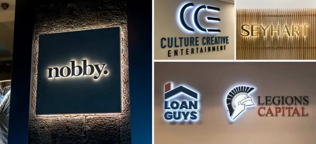
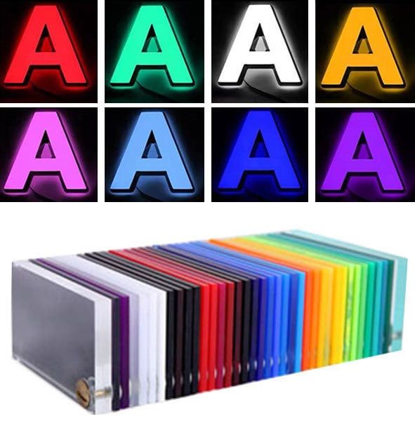
- Backlighting Integration: LED-lit acrylic signs enhance nighttime visibility and add a futuristic glow.
- Material Combinations: Pairing acrylic with metal, wood, or vinyl adds texture and contrast for boutique or industrial aesthetics.
- Custom Shapes and Die-Cutting: CNC and laser cutting enable the creation of non-standard shapes, logos, and even interactive elements.
Hermès uses layered acrylic and mirrored backdrops to create immersive brand storytelling in window displays.
Visibility Enhancement Strategies for Acrylic Signage
Visibility enhancement strategies combine color psychology, design precision, and lighting integration. Thus, it ensures signage performs optimally across environments and conditions.
i. Color Selection for Maximum Impact
- Red / White (High Visibility): Emergency exits, clearance signs.
- Blue / White (Moderate to High Visibility): Informational signs, healthcare.
- Black / Yellow (Maximum Visibility): Hazard warnings, construction zones.
Black/yellow is considered the most attention-grabbing due to high luminance contrast. Red/white is widely used in stop signs and fire safety signage due to the urgency association.
- Seasonal and Temporary Signage Strategies: Use warm tones (orange, red) for autumn promotions. Cool tones (blue, silver) for winter campaigns. Fluorescent acrylics for short-term visibility boosts in retail.
- Night Visibility Considerations: Opt for reflective vinyl overlays or backlit acrylics. Use high-contrast combinations like white on dark backgrounds. Avoid pale tones that wash out under artificial lighting.
ii. Environmental Considerations
- Urban vs Rural: Use bold colors and clean typography to compete with the urban visual clutter. Leverage natural contrast (earth tones or high-saturation colors) against the rural greenery.
- Competition Signage Assessment: Analyze nearby signage to avoid blending in. Choose colors that differentiate your brand while maintaining readability.
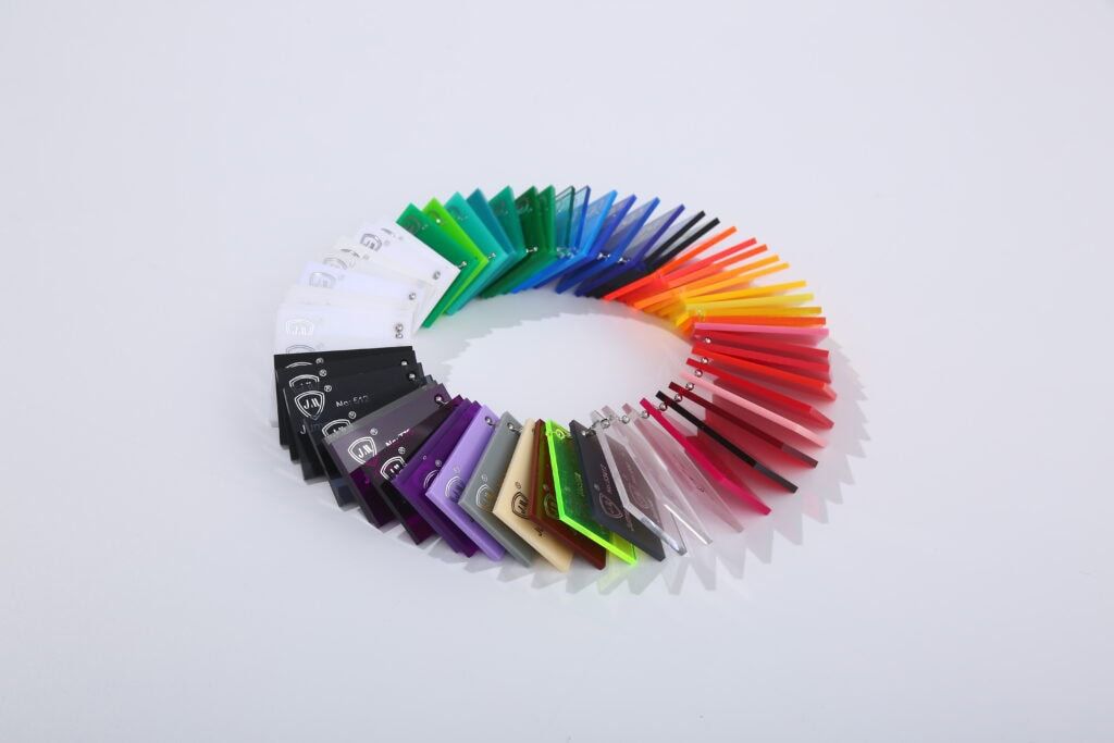
- Background Contrast Analysis: Conduct site-specific contrast tests to ensure legibility. Use color wheels to identify complementary or opposing hues for maximum pop.
- Local Zoning and Aesthetic Guidelines: Some municipalities restrict neon or fluorescent colors. Historic districts may require muted palettes or natural finishes.
iii. Design Principles for Enhanced Readability
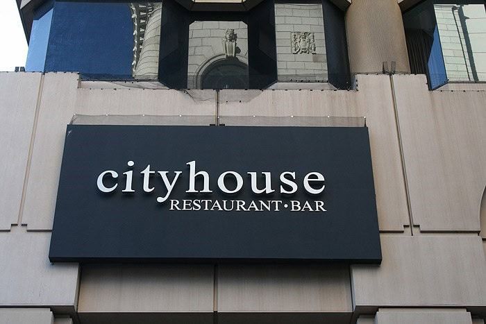
- Font Selection and Sizing: Use sans-serif fonts like Helvetica or Arial for clarity. Keep the minimum letter height to 1 inch per 10 feet of viewing distance. Avoid decorative fonts for functional signage.
- Letter Spacing and Kerning: Maintain consistent spacing to avoid visual crowding. Adjust kerning for dimensional lettering to prevent overlap shadows.
- Border and Outline Techniques: Use contrasting outlines to separate text from background. Borders improve legibility, especially in low-light or busy environments.
- Shadow Effects and Dimensional Lettering: Drop shadows add depth and improve readability. Raised acrylic letters with halo lighting enhance visibility and brand perception.
iv. Lighting Integration
Backlighting Options
- LED Strip Integration (embedded behind acrylic for uniform glow): Retail, hospitality, indoor signage.
- Edge-Lit Acrylic (light enters from edges, illuminating the panel): Sleek, modern branding.
- Color Temperature (3000K [warm] for cozy feel, 5000K [cool] for clarity): Varies by brand tone.
- Energy Efficiency (LEDs consume up to 80% less energy than fluorescents): Sustainable signage.
Front Lighting
- Spotlight Placement: Highlights key signage areas.
- Accent Lighting: Adds drama and brand personality.
- CRI Importance: CRI >90 ensures accurate color rendering.
- Maintenance Accessibility: Easy bulb replacement and fixture cleaning.
- Weather Protection: Use IP65-rated fixtures for outdoor signage.
Real-World Applications of Color Acrylic Signage
Color acrylic signage has evolved from a branding accessory into a strategic asset across industries. The following cases showcase how businesses, from national chains to local institutions, leverage acrylic.
Case Study 1: National Retail Chain Rebranding
A US-based retail chain with 500+ stores needed to unify its brand identity across locations while reducing long-term signage costs.
Solution: They implemented a standardized color acrylic signage system using Pantone-matched sheets and modular mounting hardware.
Results: 25% increase in brand recognition within 6 months. Maintenance costs dropped by 30% due to UV-resistant and scratch-proof finishes.
Best Practices –
- Centralized vendor partnerships for color consistency.
- Pre-approved design templates for scalability.
- LED backlighting integration for nighttime visibility.
Whole Foods Market used high-contrast acrylic signage in its Columbus Circle store, resulting in record-high sales and improved customer navigation.
Case Study 2: Local Business Visibility Improvement
A boutique in a crowded retail district struggled with low foot traffic due to poor storefront visibility.
Solution: Installed high-contrast color acrylic signage with edge-lit LED panels and dimensional lettering.
Results: 40% increase in foot traffic within 3 months. It improves customer acquisition and dwell time.
Implementation Timeline –
- Week 1: Design and vendor selection
- Week 2–3: Fabrication and permitting
- Week 4: Installation and lighting calibration
Budget Breakdown: $1,200 for signage fabrication, $600 for LED integration, and $300 for mounting and electrical setup.
Coca-Cola’s use of red LED acrylic signage in Russian stores boosted sales by 35–67%.
Case Study 3: Healthcare Facility Wayfinding System
A multi-wing hospital faced frequent patient confusion and staff interruptions due to poor navigation.
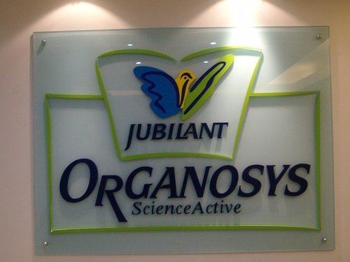
Solution: Deployed color-coded acrylic directories and ADA-compliant room signs with tactile and Braille elements.
Results: Staff inquiries dropped by 45%. Patient satisfaction scores improved by 18%.
Accessibility Achievements –
- UL94 V-0 flame-retardant acrylic is used for safety.
- Braille and tactile engraving met ADA and Title 24 standards.
Acrylic signs in hospitals resist microbial growth and meet hygiene protocols.
Case Study 4: Educational Campus Signage Upgrade
A university campus had outdated signage that failed to reflect its modern identity and was challenging to navigate.
Solution: Rolled out a comprehensive color acrylic signage program featuring school colors, wayfinding systems, and branded accent walls.
Results: Enhanced school pride among students and faculty. Visitor experience improved, with 32% fewer navigation complaints.
Community Feedback –
- Alums praised the updated look during homecoming events.
- Stakeholders noted increased engagement during campus tours.
Tokyo Ginza schools retained 90% color accuracy in acrylic signage over 12 years, reducing replacement cycles by 3x.
Conclusion
Color acrylic signage stands tall in the world of modern branding that’s heavily packed with a visual landscape. You can reach out to a bold, durable, and customizable solution to attract the target audience.
You may look into potential elevation of storefront aesthetics, guide customers through complex spaces, or create immersive brand experiences. Acrylic offers a winning combo of vibrant colors with resilience and flexibility.
Get the Top-Quality Color Acrylic Sheet from JUMEI
Not many acrylic manufacturers can secure all the points discussed above to make an impactful design. That’s where Jumei Acrylic is ready to serve with years of experience and industry-leading experts. Contact us to know how our color sheets can meet your needs.

